The Journey and Process in Life and Painting

I paint because I’m in love with my subject and I am delighted by the process of applying colour to a blank surface.

In the book Art and Fear the writers suggest that the observers who admire the finished piece of work have no interest in the artist’s process:

MAKING ART AND VIEWING ART ARE DIFFERENT AT THEIR CORE. To all reviewers but yourself, what matters is the product: the finished artwork…In fact there’s generally no good reason why others should care about most of any one artist’s work. The function of the overwhelming majority of your artwork is simply to teach you how to make the small fraction of your artwork that soars.  One of the basic and difficult lessons every artist must learn is that even the failed pieces are essential.

Continue reading

Acrylic Painting Tutorial – Iris

Right now, I’m headed outside to paint iris and lupins. Here is a repost of a blog I made in 2010 about painting at this time of year. I will try today to express the emotional connection I feel for iris as I did in this painting.

irispainting2010There were gorgeous, large bearded irises in my grandmother’s garden over 50 years ago. My mother transplanted some to her garden and eventually I had them in my garden. They moved ½ way across the continent with us when we came to Nova Scotia and are blooming like never before.

Bearded Iris from my grandmother.

I know my mom and my grandmother would have loved the yellow variety that I’ve added to the ancestral iris. And I know they would have loved the wild purple, pink and white lupins that grow like weeds here and especially at our place.

Lupins ring our land and the colour is often deep purple.

I want to show you how I painted and drew these flowers using fluid acrylics over a base of wet matt medium and I’ve made a tutorial for you about this. Enjoy!

[youtube=http://www.youtube.com/watch?v=IkxtefZipCM&feature=player_embedded#!]

I paint from life and in early June, the lupins and iris are in bloom here in Nova Scotia. I brought some into the studio and placed them in wine bottles so that I could have good close-up examples of the lupin in the distance.  Although I prefer to paint on location, at this time of year the black flies are biting, so I paint inside.

There are lupins growing in the distance.

I started this painting applying watered-down acrylic on a primed canvas. I wanted to achieve a soft, wet in wet watercolour effect.

When that dried, I applied a thick coating of matt medium over the entire canvas and then painted into it with my fluid acrylic paints. I keep them in sealed plastic containers in a muffin tin. That way they are always ready to use.

I try to limit my palette to five colours or fewer because it creates a better colour harmony in the painting. I paint with nylon brushes and I also use a rubber-tipped scraper to draw shapes into the painting.

I dip the scraper into my paint and draw with it much like dipping a pen into ink. I like the calligraphy effects that I can get by pushing the paint away and creating a line and a texture.

If the medium gets too tacky, I moisten it with a spray of water. The water also makes the paint run which adds an interesting softening effect to the work.

Golden fluid acrylics are transparent and have a high level of pigment.

As long as the medium is moist, the painting can be worked on and the scraping will reveal the colours underneath.

I love iris and I deliberately choose purple and yellow because they are complementary colours and they make the painting vibrate.

Although I have an easel, I painted this on the floor because otherwise the entire painting would drip and run if I placed it upright. That’s because I have a coating of wet matt medium on the canvas and that is the tip or secret that I am sharing with you.

Painting on the floor.

I came across this quite by accident and now I almost always paint with acrylic this way. For one, it delays the drying period, which I like; but the biggest advantage is that I can create all kinds of textures and linear marks in the painting by pushing away the colour with a scraping tool and revealing the layer of colour or canvas underneath.

I bought a gorgeous yellow iris at a plant sale this spring and I wanted to make it the focal point in this painting. Unfortunately, by the time I painted this, it had finished blooming, but I used my huge purple bearded iris as reference. That’s the beauty of being the painter. You can change the colours of anything in your painting to suit your mood!

Airing out the painting. (sold)

Check list for this painting:

Golden fluid acrylics

Rubber tipped scraper

Matt medium

Spray water bottle

Ancestral flowers

Painting detail. The purple bearded Ontario iris transforms into a yellow Nova Scotian flower.

Painting in Acrylics – the Indispensable Guide

Sometimes luck and opportunity come knocking together.Painting in Acrylics 3

Over a year ago I was invited to participate in a new comprehensive book–Painting in Acrylics – the Indispensable Guide. The publisher emailed to ask if they could feature a couple of images of paintings from my website to illustrate the chapter on sgraffito painting.

The artist-author Lorena Kloosterboer lived in Belgium and the editor in England. The book would be published in the UK and the US.

In return for my images I would be given credit in the book, my website would be mentioned and I would receive a copy of the finished book.

DSCN3319
Lilies Acrylic painting ©Flora Doehler, 2013 12? x 12? $260


I have to admit that my 1st reaction was skepticism. Like many visual artists I’ve been invited to publish my work in the past–but at a cost of hundreds of dollars in ‘books’ that would only be distributed to the participating artists.

But this offer was and is bona fide. The publisher is Quarto in the UK and Firefly Books in the US.

Painting in Acrylics 6

So how did this opportunity come about? The author found my website in an internet search. I had tagged some of the paintings as sgraffito . She was looking for samples of that style.

So if you are an artist, let this blog post be a reminder to you to include detailed descriptions of your artwork and your methods on your website so that search engines–and publishers–can find you.

Painting in Acrylics 8
Even the studio was shown, along with a shot of my set up at Paint-the-town.

It has taken years for this book to go from concept to publication. 12 months ago I submitted many images of my paintings, my studio, and my painting setup to Quarto. I sent high resolution jpegs to the publisher through the free version of Dropbox. It is a server ‘in the cloud’. I uploaded the large images required for printing, shared the password, and Quarto downloaded them. I didn’t have to make a DVD or snail mail anything.

Just before Christmas I received my very own copy of Painting in Acrylics – the Indispensable Guide.
I am so thrilled that my paintings are part of this international book. There are many painters included whose work I admire.

Painting in Acrylics 7

This is the most comprehensive acrylic guide I have ever seen with extensive information about acrylic painting–styles, materials, color theory and so much more.

There are paintings from over 90 artists all over the world.

Artist – author Lorena Kloosterboer writes clearly and is generous with her step-by-step descriptions of her own high realism painting process.

Painting in Acrylics 9

I love experimenting with art materials and this book will show me new ways of working with this versatile medium. I highly recommend this book for artists at all levels. I know that for me, getting my hands on it is a great way to start 2015!

If you want to take a closer look at the book, click on this link to view it and my current favorite art-related books.

On the Road from Realism to Abstraction in Painting

There were years and years when I believed that all abstract work was bourgeois and decadent and wasn’t actually art.   The shift in my thinking has been gradual and unexpected. All I can say for sure is that the more I paint, the more I feel drawn to the work of abstract artists. I notice this when I view art exhibitions or when I look at online works. The bold colorful paintings of abstract expressionists past and present excite and move me.

abstract4
“Garden Chaos”. Acrylic Ink sketch detail. 4″ x 4″ © Flora Doehler, 2014

And yet what I paint still remains literal… That is, the viewer knows exactly what they’re looking at. Even when I try to paint in a non-representational way it gradually morphs into a flower painting or landscape. I can’t seem to help myself.

So I decided to create a series of works that would challenge my way of approaching a painting.

Flora Doehler
“Garden Chaos”. Acrylic on Canvas. 20″ x 20″ © Flora Doehler, 2014

This series that I created for my October 2014 show in Annapolis Royal is my way of abstracting flowers. Instead of painting live flowers, I painted from sketches of mine of live flowers. The “big deal” for me was to use a previous drawing as a point of reference rather than the actual plant or flower.

abstract1
“Bee Balm”. Acrylic Ink sketch detail. 4″ x 4″ © Flora Doehler, 2014

The original drawings are ink and ink stick on watercolor paper. I cropped them that I would be forced to paint a larger-than-life version of the flower which is also not my usual way of painting.

 "Bee Balm". Acrylic painting on Canvas. 18" x 18" © Flora Doehler, 2014
“Bee Balm”. Acrylic painting on Canvas. 20″ x 20″ © Flora Doehler, 2014

20″ x 20″

The finished paintings are one painting removed from the original subject and have morphed into an abstracted painting that suggests a floral theme. I would like to experiment by cropping these paintings and developing new and changed versions of them.

abstract3
“Breathing New Life”. Acrylic Ink sketch detail. 4″ x 4″ © Flora Doehler, 2014

It’s like playing “broken telephone” with the brush.

abstract5
“Breathing New Life”. Acrylic on canvas. 20″ x 20″ © Flora Doehler, 2014

I’ve very excited to explore a new approach to a favorite subject and I can’t wait to hang these in a couple of days at my show in Annapolis Royal. Please come, if you have the chance!

poster

DSCN4194


Could This be my Favorite Painting?

You like what you like. There is no scientific formula that tells us why a person is drawn to a piece of art. But when I finished painting this cyclamen while a snowstorm raged outside the studio, I liked it so much that it became my favorite — almost replacing the previous two favorites. 🙂

Cyclamen
Acrylic Painting ©Flora Doehler, 2014
10″ x 10″
sold

I like the contrast, the composition, the texture and the colours.

But more importantly, the real fun is in making the painting because there is a mystery in the process.  I make the decisions about colour and method and technique, but as soon as I pick up the brush, the painting takes on a life of its own and evolves and shows me where to go next. Every painting is like solving a puzzle and it is embarking on an adventure.

It helped this week that snow swirled out the studio window while crows dug into the compost for any scraps they could find , (including eggshells). It made the studio time even sweeter with soothing music and coffee and a crackling wood stove.

crows in the snow

How I approached this painting

I started by flooding the canvas with gel medium. It’s like spreading a clear custard. While the medium is still wet, I brushed in the shapes of the cyclamen flowers with white acrylic paint.

Then I got out my Liquitex inks that are intensely pigmented and transparent. I squirted the ink into strategic areas of the wet canvas and gently brushed it into the gel.

Next, I drew the flowers and various other marks and lines on the canvas with my rubber tipped colour-shaper.

You can see that the gel is still wet which is a great advantage to me because it will display the brush strokes and textures.

I added some texture by ‘lifting’ some of the ink with bubble wrap and a scraper.

I continued adding detail. I let the painting dry.

P1390381

The following day I added some gentle blue tones to the flowers to give them more dimension.

Cyclamen Acrylic Painting ©Flora Doehler, 2014 10" x 10" $250
Cyclamen
Acrylic Painting ©Flora Doehler, 2014
10″ x 10″
sold

Homage to Montreal

Last week we spent some time in beautiful Montreal visiting our daughter. It was my first trip there in over 40 years (gulp) and we visited the Montreal Museum of Fine Arts. I was so inspired by the oil paintings I saw from artists in Montreal who were contemporaries of English Canada’s Group of Seven, that I came home and pulled out my oil paints and got to work.

Flora Doehler
Homage to Montreal.
Oil Painting by Flora Doehler,  24″ x 24″, 2013

I chose a yellow and green acrylic ground for the painting because of the fresh ‘alive’ feel I wanted for the bouquet.

The background is acrylic.

There are no flowers left blooming in my garden. The cold has taken care of that. The pickings are slim (pardon the pun) for buying flowers in rural Nova Scotia, but I was delighted to put together this bouquet from the  grocery store selection in Digby. If varieties of fresh flowers are important to you in winter, don’t even think about moving here.

Homage to Montreal6

By the time I finished blocking in the shapes, it was dark outside, so I called it a day. That night as I fell asleep I kept thinking about what should belong in the large yellow space. I loved the colour and I hated to cover it, but the painting needed more development.

Homage to Montreal2
I mostly worked with oil sticks which are super messy, but allow me to draw the image or use a paint brush.

And here’s the thing about painting. Sometimes the main part can happen in a spontaneous, inspired way and everything flows together. But there will always be an area of the painting that causes more grief than the rest of it put together. At least, that’s how it is for me.

I was happy with the gestural line and texture and tone of this painting and I think it reflects the feelings I had about the work I saw in Montreal. But that darned yellow canvas area…..that was a challenge to resolve.

When I woke up, I thought about the interiors I’d seen in paintings the previous week and I decided to place a chair from the 40’s to suggest a table and to give the painting a nostalgic feel.

Homage to Montreal3

But now the tabletop looked empty. I decided to include fruit. I brought out a plate of Nova Scotia Gravenstein apples and added them to the painting. I  defined the table edge on the left hand side of the painting.

Homage to Montreal4

The next day when I looked at the apples, I didn’t think they fit in the painting, so I got out my turpentine and scrubbed them out.
But in looking at the apples on my German pottery plate from the early 70’s, I’d fallen in love with the look of apples. I had to take a detour from the flower painting and begin a study of the apples. They really deserved their own canvas, wouldn’t you say?

Homage to Montreal5I went back to my flower painting and had gained another day of thinking about what to do in the big empty yellow space. I wanted something that wouldn’t overpower the bouquet.

I chose to break up the yellow of the table with a long shadow from the chair. The shadow points towards the vase to which pulls the viewer’s eye there. The shape of the shadow reinforces the style and age of the chair.

The painting will require at least a few weeks to dry. It is definitely my Homage to Montreal.

Flora Doehler
Homage to Montreal.
Oil Painting by Flora Doehler, “24” x 24″, 2013

And as for the apples. Well, they are perhaps an homage to the Homage to Montreal. 😉

oil painting by Flora Doehler
Gravensteins. oil painting by Flora Doehler, 2013.
12″ x 12″

Painting with Gel and Paint Markers

I love to try out new materials. I just discovered Liquitex’s Paint Markers and I am so excited to try them out. They  contain high quality acrylic paint in a fluid form AND the containers are refillable. After trying out this yellow marker, I’ve ordered a variety of colours in the two different sizes they come in.

I wanted to create a painting of my gorgeous Turk’s Cap lilies using a limited colour range and with a softness that fits with a breezy summer’s day. These beauties grow on stalks that reach 6 feet high and they sway beautifully in the breeze.
Using the paint marker, I sketched the flowers onto my canvas which is 16″ x 16″. P1360326
I drew with the markers as loosely as I could to create movement. I was mindful of the swaying nature of the stalks and avoided painting them in straight lines or painting them parallel to the edge of the painting. This makes the painting less static.

After the marker dried, I applied a coating of gel and matt mediums. This makes the paint slide and prolongs the drying period. I worked flat on a table. I added a touch of turquoise blue to my medium and gently filled in the background for the sky. Here I was mindful of laying down intentional brushstrokes that emphasized the negative spaces and created a light and dark pattern in the blue which also added movement.
P1360328
The use of medium also creates a transparency of colour and allows me to scrape into the painting with a rubber tipped colour shaper. I also dip my shaper into my paint and use it to draw into the painting as you can see in this next photo and in the final painting.
P1360332
I am thrilled with the outcome of this painting for these reasons:

  • It has the softness and the movement that I hoped for
  • it has the essence of the tiger lily that is a Turk’s Cap
  • the addition of the Joe Pye Weed in the background helps to pick up the patterning in the grasses and in the petals
  • using the paint markers created a lovely yellow tone in the scraping
  • it makes me smile
Dance of the Lilies acrylic painting by Flora Doehler 16" x 16"
Dance of the Lilies
acrylic painting by Flora Doehler
16″ x 16″, $375


Show of Paintings – Jan / Feb 2013

Hi there!  I’m thrilled to tell you that I’m having a showing of my paintings in Bear River at the end of January.  This will be an opportunity for me to show large paintings from the last couple of years in one space.

I will work on a painting onsite during the show.

Saturday, January 26 – February 3: A BRUSH WITH LIFE: paintings by Flora Doehler

the Rebekah
 downstairs location (1890 Clementsvale Rd.) in Bear River.

Gallery opening with refreshments on Sat Jan 26, 1 – 4 pm.
I will be at the gallery from 1 pm to 4 pm (or by appointment) on the following days:
• Sat. Jan. 26, Sun. Jan. 27
• Thur. Jan. 31, Fri. Feb. 1, Sat. Feb. 2, Sun. Feb. 3
I’ll be painting starting on Thur. Jan. 31. All welcome.

For more information, please email me at flora.doehler@gmail.com

Brier Island Heat (sold)

Here is one of a series of short videos to show you some of the paintings that will be on display.

Painting Sumachs

It’s been raining here for a few days so it was wonderful to see the sun today. It is lovely to go outside again to capture this sumach scene in front of our house.

The reds, oranges and greens are stunning.

Just like painting other plant out of doors, the time to capture this brilliant display of colour is just a few short weeks.

I start the drawing on canvas with watercolour crayons.
Next, I fix the drawing with matt medium.
My set-up was on-the-fly so I sat on the ground and leaned my canvas against a tree stump. That way, I was ‘in’ the sumachs. I felt a bit like Alice (in Wonderland).
Painting detail showing my sgraffito marks.
I like the dark patterning that goes through the painting. When this is dry, I’ll have a better idea about how much of the original crayon colour is showing. Then, I’ll make my final changes.  Painting by Flora Doehler, 2012. acrylic. 36″ x 36″

I narrowed my pallet of Golden fluid acrylics down to yellow, green-gold, purple, pyrole red, and a cerulean blue mixed with white.

I can’t wait to work on this tomorrow and to finish another Sumach painting that I started ‘in season’ last fall and is waiting to be finished this week.

Painting using Complimentary Colours as an Undercoat

I just spend a fabulous week painting on Brier Island, Nova Scotia where the Bay of Fundy meets the Atlantic Ocean. I went there with other artists and you can read more about it here.

I want to show you another way of working with acrylic and watercolour sticks.

Brier Island painting by Flora Doehler, 2012
On Brier Island, looking towards Meteghan.

During the trip I noticed one of the other artists creating beautiful little watercolors with her watercolor sticks.  Another artist was using a underpainting in a complementary color to the main color  of her painting.   I  have used both of those methods/materials but it got me thinking;  what if I used my watercolor sticks as the underpainting and chose colors that would be complimentary to the local paint color? In other words, what if I used a red crayon underneath where I would be painting a green tree and allowed some of that red to show through?

header-brierisl-setup

Brier Island
Summer on Brier Island, by Flora Doehler, c. 2012.

complimentary

Brier Island
Pond Cove
Brier Island Afternoon
Brier Island Afternoon (sold)
Westport on Brier Island. Ink drawing by Flora Doehler, 2012.

I had some Derwent  watercolor artbars. I love their triangular shape because it’s possible to mark the canvas with broad strokes.

Drawing on canvas with watercolour sticks.

I drew my back ground using the complementary colors. This was a good exercise in reading the landscape as a series of shapes — although I must admit I deviated from the plan a little when it came time to painting.

Fixing the watercolour crayon by brushing matt medium over the canvas.

In order to ‘fix’ my drawing and to prevent it from dissolving into the paints, I brushed matte medium over the watercolor crayon and something very exciting happened. The medium dissolved and activated the crayon drawing making it blurry but also making the color of it spread into intense colour.

The intensity of the colour was brought out by the matt medium.

After the medium dried, I added more medium to the surface and then painted using my fluid acrylics. This is so that I can scratch into it and reveal the crayon colour underneath.

Briar Island painting by Flora Doehler. 16″ x 16″

I’m looking forward to developing new work using this method. And it just goes to show you the benefit from working with other artists and from having a good chunk of uninterrupted painting time.

Painting with Slow Drying Mediums

This summer we’ve had very hot weather which made painting difficult. Acrylic paintings I worked on dried faster than I wanted them to. So, I’ve been using gel mediums that are formulated to slow down the drying time of acrylic paint. This allows me a longer time to apply the paint and to draw into my work revealing the canvas underneath.

Let me show you the steps I take.

Brilliant yellow golden globe flowers were one of the inspirations for this painting.

First I paint the medium on the entire canvas. I used a combination of a pouring medium from Golden Acrylics and a thicker one from Liquitex. For the background colour I dripped Liquitex inks into the medium.

Canvas with wet gel and ink.

Then I blended the ink into the gel with a brush. This will be the background and will help to unify the painting.

Canvas with wet gel and ink.

Next, I studied my reference materials…in this case flowers from my garden that have bravely weathered this summer’s drought!

Then, using broad strokes, I painted a suggestion of flowers onto the canvas.

Painting detail.

I try to lay in the colour with single strokes. This way, the gel allows every brushstroke to show. I like the freshness of painting this way.

Painting in broad strokes.

Sometimes I put two colours on the brush to add to the surprise and spontaneity of the brush stroke. I mostly paint with Golden Fluid Acrylics and I keep them in small plastic containers.

I use lots of brushes and rubber-tipped shapers.

Finally, I draw the scene using a rubber tipped shaper. This technique is called sgraffito.  I add a few more colours and at this point it is a push and pull effort. I try to keep the freshness of the colours as well as building up a contrast and creating a pattern of colour that goes through the entire painting.

painting by Flora Doehler
Acrylic painting by Flora Doehler. 2012. 16″ x 16″

I can only get this effect by using gels and the slower drying mediums/gels allow me to work for several hours on the painting.

I am happy with my result. It totally reflects the joy I felt in looking at my garden flowers on a hot day in August.


Painting Winter Fields

Charcoal sketch of field patterns.

It’s absolutely gorgeous outside right now. There is a thick blanket of snow covering the fields, and the  hills. With all the leaves gone it is really easy to see through the trees to the hills on the other side of the river.  What I see is long stripes of trees that border fields, slashed diagonally by roads that wind their way down the hills.

Looking from the Annapolis side towards Riverview Road.

The colors now are so muted that it is a challenge for a color-loving painter like me to actually paint that scene in a monochromatic way.  in fact it would be easier for me to use brilliant colors to depict the snow scenes around me–but I want to try an abstracted approach using muted colors.

Acrylic on canvas.

I start with charcoal drawings to get a sense of the shapes in the distance.

Charcoal sketch of snow scene.
Larry is immersed in creating a pendant and is listening with me to a podcast from This American Life about the fictitiousness of money, starring the Federal Reserve.
I discovered, quite by accident, that if I put my paper on top of the hot wood stove, and draw on it with crayon that the wax melts instantly and leaves a very dramatic line.This must be what encaustic painters experience!
Melted crayon on paper and charcoal.
I chose for my palette:
  • anthraquinone (blue )
  • burnt sienna (rust)
  • raw umber (brown)
  • titanium white
  • carbon black
These canvases are 16″ x 16″. I’m using fluid acrylics mixed with matt medium. This one was my favorite as far as the intensity of colour.

I rarely use burnt umber and I never use black. In fact I hardly ever use white either. So all of these choices amount to a complete departure for me. But I was determined to give it a try.
This was my favorite of the 3 canvases as far as paint texture goes.
I will work on them tomorrow with the objective to create a more harmonious look and feel to the 3 canvasses. Although I really like the intensity of the colour, it is more than I intended. But, a reduced colour seems to go against my very nature. I may try to mute things anyway. Stay tuned!
Canvases drying on my new cushioned mats. (I stand when I paint).
This is a good exercise to work on while winter is upon us!
The studio is like a giant playroom for Larry and me.

Intentions for 2011 at Green Willow Studio

Our Green Willow tree,  Cordelia, has finally dropped her leaves. A Cherry tree stands to the right and produces tasty cherries that drip down your chin in the summertime.  Mostly the birds get the bounty as the limbs are too high for us to reach. Our studio is the red building. The other two ‘public sides’ are painted periwinkle blue. We heat it with a wood stove and a small space heater.

2010 was the ‘birthing’ year for our Green Willow Studio. We started with an uninsulated garage and transformed it into a warm, walled and electrified studio! It took us some time to get everything arranged so that a silversmith and a painter could work in the same space. Together, yet apart.

Most of the time it works. We listen to music or to podcasts. We break for tea or coffee and either talk about our work or we go for a walk around the garden to get a different perspective.

It is a thrill for us both to have the luxury of such a well lit room (there are windows on all four walls!) and to be surrounded by garden and a wild field where pheasants live.

As part of the Bear River working artists studio tour it was essential for us to have our studio ready for the beginning of the tourist season in May. We set up a display area in the studio where people can buy our work.  We have met some wonderful people that way and have sold some pieces.

Tulips. Acrylic on canvas by Flora Doehler. SOLD


My painting sales this year at the Flight of Fancy, at Paint the Town and in the studio were motivating and rewarding.  A series of one-on-one art coaching and tutoring in painting has helped me to share my painting techniques and to practice teaching. Attending the Bear River Artists and Farmers Market nudged me to develop affordable art as well as gave people a chance to see my work.


Larry received jewellery commissions and is showing sculptural pieces at Art and Jules Gallery in Halifax.


“Growth Spurt” hammered copper vessel by Larry Knox, 2010.
Now 2011 lies before us like a blank canvas or like a shiny sheet of copper waiting to be formed.
The possibilities are infinite; the ideas are many and there are decisions to be made about content, about intention, about the best way to express one’s creativity.
Blooming summer flowers were a constant inspiration.
 I will spend more time posting to this blog and sharing step-by-step, the creative discoveries and techniques that I am using in my work and that Larry is using in his work. Up until now my blogging focus has been on our day to day lives in our adopted village of Bear River. After three years there are over 100,000 hits on that Blog and it has even brought visitors to Bear River. It’s time for me to shift some of the energy spent in promoting Bear River into sharing our artistic life and promoting our work to the world!
Commissioned copper and silver bracelet by Larry Knox.
Copper pieces.


Larry and I are excited about these developments and we look forward to sharing our creative journey with you in this coming year.  Thanks for your virtual visit!
Happy New Year and may you experience many creative moments in 2011 and may some of them be inspired by our creative journey.
Painting outside in the summer.

Painting the Historic Gardens in Annapolis Royal

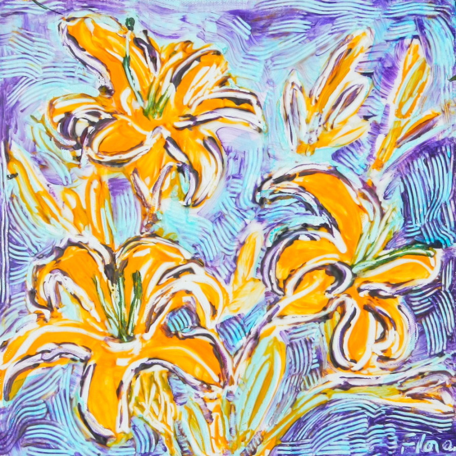
In the Begonia Garden by Flora Doehler, 2010. 8″ x 8″

This past weekend I joined over 70 artists to Paint the Town’ in Annapolis Royal. This annual fundraiser for the local Arts Council is a great opportunity for artists to show and sell their work and for collectors to watch artists at work and to buy art at reasonable prices.

The Annapolis Region Community Arts Council (ARCAC) has sponsored the event for years and the weekend runs like a well-oiled machine. Artists arrive from all over Nova Scotia…over 7o painters this year. The artists set up all over town.
Plein Air Painting kit
If you are curious about the contents of my painting kit, click on the photo and read the notes at Flickr.
Volunteer ‘runners’ circulate and pick up the finished pieces in pizza boxes and take them back to the gallery at the Legion where they hang for sale all day with a ‘gallery’ price determined by the artist. At 5 o’clock the unsold work is auctioned by silent auction. The Arts Council gets 50% of the amount and thousands of dollars are raised this way every year.


The Artist entry fee is $12.


I was thrilled to be able to set up my paints at the Annapolis Royal Historic Gardens. This park is an oasis of flower garden beds organized around the centuries of the town.
The first morning I scouted around the park with its ancient trees.
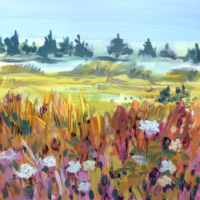
I set up in a great spot with dappled light under towering trees. The begonias were a riot of colour and were nicely contrasted by blue salvia flowers. I pulled out all my gear and promptly dropped my piece of German Plum Cake upside-down on the grass. Not to be discouraged, I brushed it off and enjoyed it with my coffee while I studied the flowers and thought about my painterly approach to them. Meanwhile birds hopped around and sang and it was wonderful to be there.


Surrounded by happy flowers.

Wonderful until I realized that I’d forgotten to bring containers for my paint water!! I finished my treat and headed for the recyling bin where I found plastic juice containers! My sharp knife soon transformed them into water jars and it was smooth sailing after that.

Here are the works I painted in the Begonia garden on Saturday. (Click on the images to enlarge them.)
The next day, Sunday,  I spent the early morning in the Victorian Garden while there was still some shade to work in.
The colours were vivid and the zinnias were taller than me. At one point a butterfly was brought out and released to much fanfare.


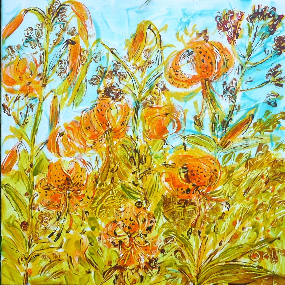
This was my largest painting. I used up all my matt medium on it.

My Sunday problem was that I ran out of matt medium! It’s an essential part of my kit because I use it to get the scratching-in effect in my paintings. I searched out other artists in the park and was given some by artist Shannon Bell and when that ran out, a bottle of the stuff from Louise Baker, an artist with a love of colour who lives in Halifax. Thank you Louise and Shannon!!!

Here are the paintings I did in the Victorian Garden until the sun drove me away. (Click on the images to enlarge them.)

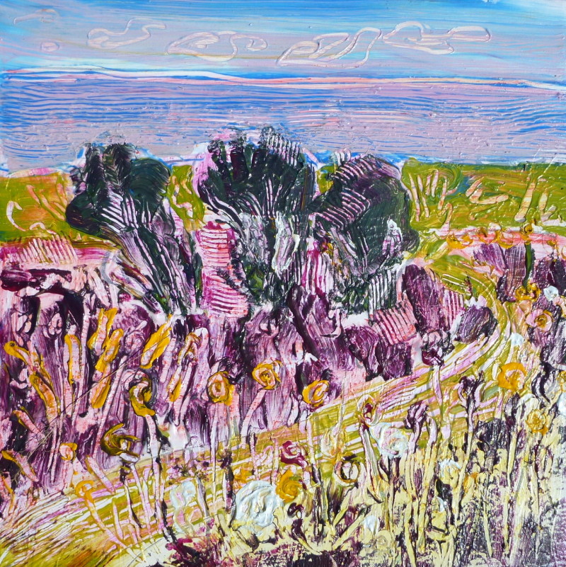
After the heat of the flowers and the sun, I decided to seek out a cool, shady, quiet spot. I found this at the Lily pad pond.
The mosquitos thought it was a pretty nice spot too, in spite of my liberal spraying of citronella. In fact a couple wandered by while I was painting and asked me if I could tell them which flower was giving off that scent. I told them that I was the flower and we had a good laugh over that.


The challenge here was to edit the elements down to make sense of the scene in a painting.

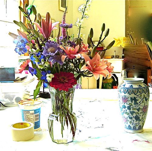
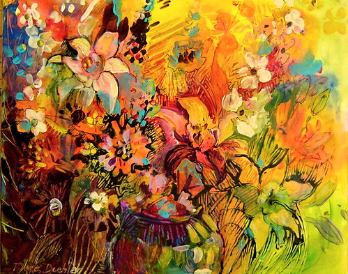
They were visiting from Montreal and I told them about the silent auction. They later lost out on the bids for 2 of my pieces, but found their way to our studio the next day where they bought 2 paintings that I had been working on in my garden. Here is one of them:

Nicotiana
Nicotiana in garden chez moi.


It was truly wonderful to connect with some of the people who bought my works. Over half of the purchasers and bidders had watched me paint in the park. They connected with my interpretation and they also connected with the setting. I think it was nice for them to see the process (well, not the dropped plum cake part). Oh, did I mention that all 12 paintings and sketches that I did over the weekend sold? It’s three days later and I’m still flying high about it.
These were my paintings at the lily pond. (Click on the images to enlarge).
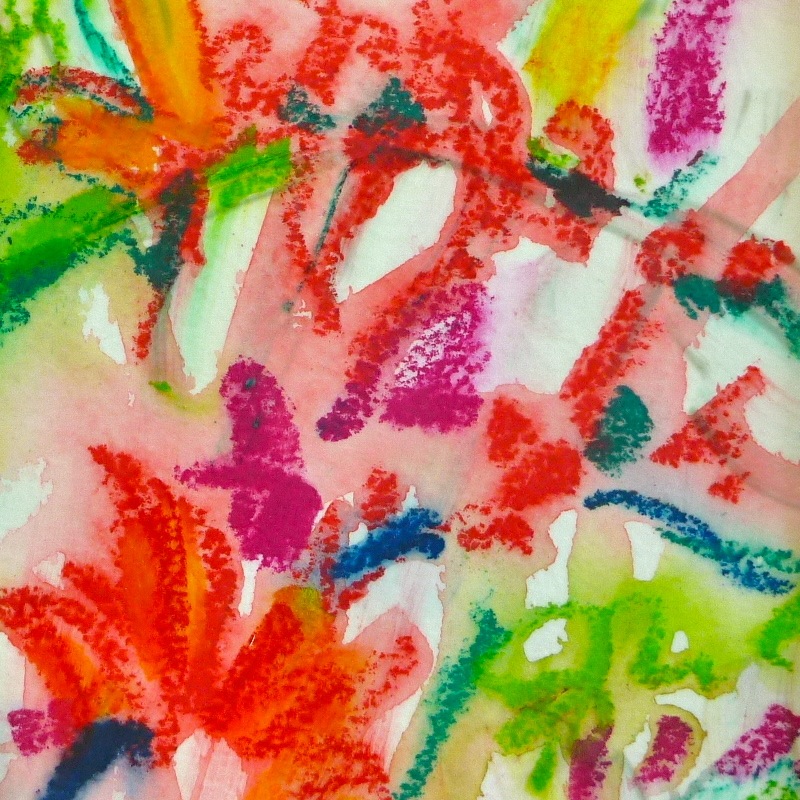
At the end of the day I sketched the scene for myself with marker and brush on damp paper. A charming woman from New York walked by to admire it. She thought it would make a gorgeous wallpaper. I told her that it was my souvenir of the weekend and she suggested that I offer it at the silent auction so that she could bid on it.
Well I did and it sold for $50. Here it is for you to see:


The Pond sketch on 9″ x 12″ watercolour paper. ( The paper is actually white)
Acrylic paint brushed into damp paper.

It was an exciting weekend on many levels – wonderful to meet painters, wonderful to have such a positive response to my work, wonderful to create in such an inspiring setting. And, wonderful to earn some money too which was just as well because our house water situation was failing while I painted.

See you next year at Paint the Town!

photo courtesy of Trish Fry, Annapolis Royal Historic Gardens.

Evolution of a Painting

Painting in the studio.
Starting a painting.

I like to paint from life, which means painting on location or with the thing that’s being painted actually present.  Painting from photos just isn’t nearly as satisfying for me because I can’t get as close to my subject as I would like to. You see, not only do I like what happens when paint goes on a surface – the explosion of color and movement of the brush over the canvas or paper and the mixing of colors, I very much enjoy looking at my subject and really, meditating on it.

This Peony is stunning and so is the shadow. The scent is also out-of-this-world!

If I’m outside I can listen to the sounds around me of birds singing or the sound of the wind rustling leaves or grasses blowing in the wind.  I enjoy the smell of the air and the fragrances of the earth and plants.

These 12 tall hollyhocks were so inspiring and called out to be painted.
These 12′ tall hollyhocks were so inspiring and called out to be painted.

I like to watch shadows flit across a field when clouds move across the sun. I enjoy the many shades of green in the landscape. Painting becomes a truly sensual experience.

The painting is 3 feet high and was started on location and finished in the studio.

If I can’t go outside because of cold weather or rain, I can still set up a still life and paint indoors. In that case I am often examining flowers close-up and checking out the petals and the shapes of the blooms. When I lived in the city it was possible to buy fresh flowers, even in the winter, for a very low price.  Unfortunately, that is no longer the case for me here in Bear River.  Fresh flowers are very expensive and the choices are quite limited.

Last summer I had a flower subscription with Cheryl Stone of Bear River Blooms.  Every week Cheryl would deliver a fabulous bouquet to the studio complete with vase. Cheryl grows the flowers herself and will cut for you a totally custom-made bouquet.

Flowers by Bear River Blooms

Cheryl would call me in advance to find out what my colour choices were and ask what type of flower I preferred. Talk about being pampered! I wasn’t able to paint all the beautiful bouquets she delivered but I did take photos and now I am printing some of them out to use as inspiration for my new paintings.  It’s certainly not like working from the original bouquet but because I staged the photos in the first place with a painterly composition in mind, it’s the next best thing.

This photo of mine has inspired me to paint.
This was one of my favorite bouquets last summer.

 I love peonies, in part, because they remind me of my dear mother and my grandmother – two wonderful, clever and witty women who passed on their love of flowers and of gardening to me. What I also like about this photo are the colours. The contrast of the lime green in the lupines with the dark pink of the peony are very appealing. Red and green are complementary colors which I like to use in my paintings.  I decided to use that pale lime green as the ground or the background for the canvas.

Here is a video of my first approach to painting this bouquet. It morphed quite a bit until I felt OK with the results.

When I work on a new painting, I do so as long as it gives me pleasure.  If I start feeling like I don’t know where to go next or I feel a sense of frustration, I stop.  It is possible to look at the same piece of work on different days and feel different levels of satisfaction with it.  Sometimes the only way to know the next step with a painting is to put it away and to work on something else.

This week I returned to the painting and was so excited about working on it, that I thought of different ways to express “peony” and started 2 more paintings!

I’m very happy with the painting. I like the textures and the colours and the feel of it. However, the real thrill was in the making of it and now that it’s over, I can’t wait to move on to the next.

Last Summer. 30 x 36, acrylic.
Last Summer”. 30″ x 36″, acrylic (sold)

This painting, inspired by Cheryl’s flowers has inspired more paintings from me. And inspired is a wonderful state to be in.

Painting detail.
Painting detail.

Inspiration. Where does it come from?

Creative inspiration.

Where does it come from and where does it go to? Like all eternal questions the answers vary from person to person and the reasons are complex.

There are several ‘givens’ for me. My feelings have to kick in. I have to feel an inkling of an inner joy or excitement about looking at the object that I want to paint. I like to be well-rested so that I can focus on the task at hand. I feel especially inspired by nature, by colour, by visual things around me. Sometimes I am amazed by the sight of a flower grouping or a landscape or a cloud formation or even a colour and I want to stop everything and pull out the paints. I like to play music that accompanies my mood and my approach to the canvas.
Cloud in Bear River East
Sometimes a life event will trigger the painting. My painting Exuberance that sold recently at the Flight of Fancy in Bear River may look like a flower painting, but it was really a celebration of a breakthrough in my painting style.


After painting exclusively with watercolours for years, I had discovered fluid acrylics and found them to be a logical extension of wet-in-wet watercolours. Fluid acrylics have both the translucency and brilliance of watercolours with the advantage of the flexibility of acrylic. I was so excited about this and I think that energy came through in the painting.

Recently I’ve been getting my inspiration from beautiful Bear River Blooms on Sissaboo Road. This flower growing farm is worked by the caring hands of Cheryl Stone. Her bouquets are loaded with blooms, they are fresh, cheerful, colourful and the ones I’ve been getting from her have a country-cottage feel to them. How could I not be inspired

I drew inspiration from a bouquet to develop my current painting.

For me, the painting process starts out as an exercise in getting to know the subject matter. I focus on the object so intensely that I don’t want to talk to anyone or to be interrupted. (My wonderful studio-mate and life-mate Larry is very respectful of this).

Next, I choose the colours that I will use. My objective is to narrow it down to 3 to 6 colours. It’s a tough discipline, but it means there will be more harmony in the painting.

I changed the colours of the blooms as I was in an “orange” mood. 

The flowers emerge out of darkness and for me, this painting is about the joy I feel in finally being set up in a fabulous studio and having the chance to play with colour.
Into the Light  (sold)

It is interesting to me how much more I get out of the flowers knowing they were lovingly grown by someone I know. If you get a chance to go to the Annapolis Farmer’s Market, stop by Cheryl’s booth and buy some old-fashioned blooms that last forever.

Some of the music I listened to was Jane Ira Blooms’ Chasing Pollack. It’s quite jazzy and loose. You can sample it here.

I also listened to the Peat Bog Fairies and you can hear them in the background of this little video of me painting. They live on the Isle of Skye in Scotland, an extremely inspiring place if there ever was one!

The pasty looking gunk on the canvas is matt medium. It allows me to move the paint by scratching it and scraping it. It also dries clear. You can also see which colours I used for this piece.