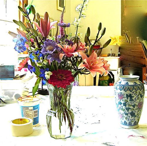
This post is cheating really because these photos are neither metalsmithing pieces nor paintings, but oh, aren’t the colours just gorgeous? I photographed them in the studio today and tried to set them up in compositions that would be interesting to paint.
I love the shapes and the colours in these photos. I tried to be mindful of the negative spaces around the flowers as well as the postive flower shapes. As I pointed my camera at them, I imagined the viewfinder as being a canvas and snapped away. Continue reading →
One night last August, Larry drove us home through the Annapolis Valley while this sky drama unfolded. That ribbon of orange light that contrasted with the purple-indigo sky was so captivating that I’d wished I could paint it. I snapped these photos with my digital camera. (I never even go to the grocery store without it.)
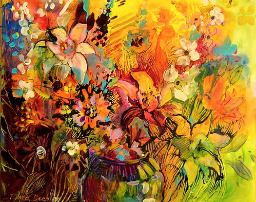
While I was painting the flower bouquet, I remembered these photos and how I’d always meant to paint the scene. Only at the time, I thought I’d use watercolours. Now that I’m experimenting with oil paints, I really wanted to interpret the scene with my oil paints and oil sticks. Continue reading →
I’ve been working in our studio on an oil painting and using the techniques that I learned this week at Wayne Boucher’s studio. So far, I’ve applied the paint by
using mostly oil sticks
squeezing paint out of tubes directly onto the canvas
Before today, the last time I had any instruction in oil painting, I was an international student in Germany. That was 40 years ago in East Berlin.
Since then, I’ve been to lots of watercolour , mono-printing and acrylic painting workshops, but never oil painting. I often think of oil painters as fairly traditional realists who use muted colours, whereas I prefer strong colours and an expressionistic approach to my subject matter.
Wayne Boucher's Studio is in a former classroom in Parker's Cove.
Last weekend at the Annapolis Region Community Arts Council(ARCAC) Annual General Meeting, I ran into Nova Scotia’s celebrated painter Wayne Boucher who breaks all of my stereotypes about oil painters. His work is bold, abstract and etherial. He loves colour and has a background in printmaking, which I think informs his choice of method and materials. Continue reading →
I wrote about how difficult it was for me to motivate myself to paint after setting it aside for months. In order to get back there, I had to remind myself about what I had done in the past to jump-start my creativity when I’d had a ‘fallow’ time.
I turned this unfinished watercolour sideways to use as a background for a portrait of some tulips I bought.
Question: How do you become re-motivated to do a beloved activity again?
Answer: Try doing whatever worked in the past.
My watercolour palette.
I haven’t written very much about the art side of our lives lately. My painting took a back seat when we finally moved into our wonderful house six months ago. Continue reading →
Lupines grow all over the Annapolis Valley, especially along the roadsides.
With my shoulders and legs sore from rototilling the garden, I headed for the studio at the end of last week to paint some of the fabulous purple lupines that grow wild around our house. I also wanted to capture the beauty of some masses of Siberian Iris that my friend Pamela gave me from among the hundreds that grow in her flower gardens. Continue reading →
About 35 years ago when I was an art student in East Berlin at the Kunsthochschule Weissensee, I painted with oil paints. At that time, in the 1970s, it was impossible to buy acrylics in the GDR (German Democratic Republic). I suspect that there was a shortage of raw materials that made plastics. Thus there were absolutely no plastic bags (people used cotton bags) and there was very little product packaging using plastic. It’s funny that now, 35 years later, we are trying to reduce our oil-dependancy by scaling down plastics usage.
In that land of socialism, university tuition was free and art students received a monthly stipend to live on. The rent on my little apartment was capped at 8% of my monthly stipend.
Deciding where to place the next flower.
My area of study was painting so a couple of times a year I accompanied my teacher, Professor Wolfram Schubert , to the school store room to receive about 30 tubes of oil paint, compliments of the state.
Evening on Nepperminer Lake by Wolfram Schubert, 2009 (oil)
Oil paints last a long time, so after three years I had accumulated quite a few. I brought a lot of tubes home to Canada with me and even though I’ve given quite a few away over the years, I still have a container full of them that I brought here to Bear River with me.
I was reminded of this a while ago when I pulled them out to use as ink in printmaking. I wondered what it was like to paint with oils compared with the acrylics that I’ve been using for the last 20 years.
My Flowerdale tea pot. Oil painting by Flora Doehler c2006
I love the smell of linseed oil (which actually is flax seed oil!) That’s right! The flax plant gives us linen fabric and the seeds are pressed into an oil. When it’s boiled, it becomes linseed oil. Because of the high oil content, the paint is thick and creamy like peanut butter. In comparison, acrylic, which is plastic, is very slippery. Watercolor, like the name implies, is like brushing colored water over a sheet of paper.
I have a very cheerful pot of daffodils and I wanted to create a feel in this painting of the chaos and joy and persistence of the life force that are reborn every spring.
Inspiration in a pot.
In the smaller painting I started with a pale green yellow ground. A few months ago I bought some oil sticks and I just had to try them out! They look like gigantic crayons but they are actually oil paint suspended in a medium that makes them a little harder than paint. If you dip your brush into a solvent and move it over the oil stick mark on the canvas, the colors will instantly dissolve. I enjoyed experimenting with them.
It is so different than working with acrylics- which dry extremely fast…sometimes too fast. I had to wait several days until the oil in the paint was dry enough to paint more colors that won’t dissolve the colors that are already painted. I have discovered an advantage to this slow dry. Using solvents, I easily removed a section of the painting that wasn’t working for me.
Removing some paint.
I’m very happy with my finishedl daffodil painting. I like the drawn lines and the colours that are softer than I usually use. I think it has a good centre of interest.
Daffodils. Oil paint and oil stick. Flora Doehler, c. 2009
The larger painting has been more challenging. I have probably spent more time repainting a daffodil in the middle of painting than on the 2 canvases put together. I overpainted it way too many times. Finally I have just scraped and sanded and painted out that section. I’m going to wait a while to complete it because right now it feels like I’m having a power struggle with the poor flower! One day I’ll be in the studio and I’ll sneak up on it and finish it!!
Daffodils in progress.
Although switching mediums can be frustrating, I really like to mix it up because it keeps me learning new ways to approach the subject matter. It keeps me more aware of the properties of the colours and brushes I’m using. Each new way of interpreting the beauty I see around me helps me to better understand what I’m actually looking at. But most of all, it’s just so much fun moving from oil to acrylic to watercolour to printmaking and squeezing out a bit of the past into my present painting.
This winter I’ve been printmaking using easy-peasy materials. I enjoy the high contrast and the textures that printmaking presents, and I wanted to bring that same feel to my next painting.
Inspiration comes from different places all the time. In the case of this painting the color, the tulips, the pears, the spring season, and the friendship behind the vase all combined to inspire me. Continue reading →
I have always loved printmaking. Maybe I have in my blood. My father was a Linotype operator and my mother was a writer and an artist who painted with oils and pastels.
The inspiration for the prints was this cheerful pot of daffodils.
I am one of the few people who actually likes the smell of oil paints –but I digress. The online course in fibre arts that I recently took used stamps in the projects so I decided to save some money and to make my own.
Pulling a proof.
The problem was I couldn’t find my woodcuts carving tools as they are either still packed away in a box somewhere or they didn’t make the trip here 18 months ago when we moved.
Oil print on cotton rag paper.
Something that I am learning in Bear River is how to improvise. When people live on reduced means and are far away from stores that supply everything, they are forced to get inventive. This kind of creativity and innovation is a skill that I didn’t develop very well growing up in the city.
Making a print using foam.
I’d like to think that the innovation is rubbing off on me now because I have figured out a great way to make a stamp for printing using readily available tools. I’m sure this is not original — probably several hundred other people have figured it out already, but it still excites me.
Glue foam pieces to board backing.
I’ve made a little video to show you how to do this and if you try it I hope you have as much fun as I am having!
In the past couple of weeks I’ve been printmaking. I enjoy the resulting high contrast and the textures in printmaking, and I want to bring that same feel to my next painting.
I added line and colour to this print.
This is a story of how one thing leads to an unexpected other thing. The online personal symbols class led to this printmaking experiment. In a later post, I’ll show you how it has impacted my painting.
Adding watercolour to the print which is printed on watercolour paper.
While my main form of artistic expression is painting, working with textiles has a big appeal for me too.
Playing with fabric and fibres in the studio.
At different times in my life I have woven, screen printed on fabric and sewed with appliqué.
Hand woven cotton warp.
My approach to textile work is very similar to painting. In both cases I use strong colour; I enjoy lots of texture and I use the interplay of light and dark and complementary colors.
Fabric painted with acrylic, printed with bubble wrap.
Many, many well-known painters have worked in this medium. Last spring in Los Angeles I saw some beautiful paper appliqués by Matisse in the museum there that inspired me to sew this little bag.
Cotton, arctic fleece, netting and ribbon.
My daughter Emilyis an animator and I am inspired by how she integrates her animation sensibilities into her sewing.
Emily designs, sews and paints dolls and creatures.
Another source of inspiration for me is artist’s blogs and sites on the Internet. I check the daily blog of my friend and fellow painter Barbara Muir. I love her use of colour and we had many shows together in Toronto. Her persistence at writing a daily blog about painting inspires me to create and make better use of all the precious time I have.
Barbara drew me while we talked on Skype!
Recently I came across the site of Susan Sorrell, a fiber artist. Her work excites me because of her bold use of color and texture. I signed up for an online class with her called Personal Symbols — who could resist signing up for a course with the name like that!
Susan Sorrell’s work.
Susan has been teaching for a number of years and the course comes with PDF handouts with lots of photographs. She has a forum on the Internet for the class where participants can show and tell their progress. I haven’t used the exact materials on her list. I’m adapting what I already have. Susan suggests painting fabric dye on interfacing fiber, but I’m using canvas and watered-down acrylics.
The assignments use a combination of drawing, painting and sewing which is quite exciting for me to combine.
Combining symbols.
There are at least three assignments connected to each of the six lessos. Ingeniously she had each of us draw and make up some of our own symbols.
My Symbols.
In the following image I have cut out and combined some of my symbols. The fabric is cotton and I ironed a stitch witchery product to the back of the cloth before I cut the pieces out. In this way the pieces stuck down when ironed. Then I embellished it with buttons and beads.
I would like to try some of these techniques in acrylic on a large canvas. It’s nice to know that it’s possible to take a course online and to feel so inspired by it and by the links to images and blogs and websites of other participants.
Susan Sorrell offers quite a few different online courses. Her enthusiasm comes across loud and clear and I would recommend any of her courses. She also hosts a monthly chat with people in the creative arts and that is quite inspiring too.
The course is opening a new world for me…a truly virtual community of people combining paint and fabric and a passion for creativity.
I like to paint from life, which means painting on location or with the thing that’s being painted actually present. Painting from photos just isn’t nearly as satisfying for me because I can’t get as close to my subject as I would like to. You see, not only do I like what happens when paint goes on a surface – the explosion of color and movement of the brush over the canvas or paper and the mixing of colors, I very much enjoy looking at my subject and really, meditating on it.
This Peony is stunning and so is the shadow. The scent is also out-of-this-world!
If I’m outside I can listen to the sounds around me of birds singing or the sound of the wind rustling leaves or grasses blowing in the wind. I enjoy the smell of the air and the fragrances of the earth and plants.
These 12′ tall hollyhocks were so inspiring and called out to be painted.
I like to watch shadows flit across a field when clouds move across the sun. I enjoy the many shades of green in the landscape. Painting becomes a truly sensual experience.
The painting is 3 feet high and was started on location and finished in the studio.
If I can’t go outside because of cold weather or rain, I can still set up a still life and paint indoors. In that case I am often examining flowers close-up and checking out the petals and the shapes of the blooms. When I lived in the city it was possible to buy fresh flowers, even in the winter, for a very low price. Unfortunately, that is no longer the case for me here in Bear River. Fresh flowers are very expensive and the choices are quite limited.
Last summer I had a flower subscription with Cheryl Stone of Bear River Blooms. Every week Cheryl would deliver a fabulous bouquet to the studio complete with vase. Cheryl grows the flowers herself and will cut for you a totally custom-made bouquet.
Flowers by Bear River Blooms
Cheryl would call me in advance to find out what my colour choices were and ask what type of flower I preferred. Talk about being pampered! I wasn’t able to paint all the beautiful bouquets she delivered but I did take photos and now I am printing some of them out to use as inspiration for my new paintings. It’s certainly not like working from the original bouquet but because I staged the photos in the first place with a painterly composition in mind, it’s the next best thing.
This was one of my favorite bouquets last summer.
I love peonies, in part, because they remind me of my dear mother and my grandmother – two wonderful, clever and witty women who passed on their love of flowers and of gardening to me. What I also like about this photo are the colours. The contrast of the lime green in the lupines with the dark pink of the peony are very appealing. Red and green are complementary colors which I like to use in my paintings. I decided to use that pale lime green as the ground or the background for the canvas.
Here is a video of my first approach to painting this bouquet. It morphed quite a bit until I felt OK with the results.
When I work on a new painting, I do so as long as it gives me pleasure. If I start feeling like I don’t know where to go next or I feel a sense of frustration, I stop. It is possible to look at the same piece of work on different days and feel different levels of satisfaction with it. Sometimes the only way to know the next step with a painting is to put it away and to work on something else.
This week I returned to the painting and was so excited about working on it, that I thought of different ways to express “peony” and started 2 more paintings!
I’m very happy with the painting. I like the textures and the colours and the feel of it. However, the real thrill was in the making of it and now that it’s over, I can’t wait to move on to the next.
Last Summer”. 30″ x 36″, acrylic (sold)
This painting, inspired by Cheryl’s flowers has inspired more paintings from me. And inspired is a wonderful state to be in.
Where does it come from and where does it go to? Like all eternal questions the answers vary from person to person and the reasons are complex.
There are several ‘givens’ for me. My feelings have to kick in. I have to feel an inkling of an inner joy or excitement about looking at the object that I want to paint. I like to be well-rested so that I can focus on the task at hand. I feel especially inspired by nature, by colour, by visual things around me. Sometimes I am amazed by the sight of a flower grouping or a landscape or a cloud formation or even a colour and I want to stop everything and pull out the paints. I like to play music that accompanies my mood and my approach to the canvas.
Cloud in Bear River East
Sometimes a life event will trigger the painting. My painting Exuberance that sold recently at the Flight of Fancy in Bear River may look like a flower painting, but it was really a celebration of a breakthrough in my painting style.
After painting exclusively with watercolours for years, I had discovered fluid acrylics and found them to be a logical extension of wet-in-wet watercolours. Fluid acrylics have both the translucency and brilliance of watercolours with the advantage of the flexibility of acrylic. I was so excited about this and I think that energy came through in the painting.
Recently I’ve been getting my inspiration from beautiful Bear River Blooms on Sissaboo Road. This flower growing farm is worked by the caring hands of Cheryl Stone. Her bouquets are loaded with blooms, they are fresh, cheerful, colourful and the ones I’ve been getting from her have a country-cottage feel to them. How could I not be inspired
I drew inspiration from a bouquet to develop my current painting.
For me, the painting process starts out as an exercise in getting to know the subject matter. I focus on the object so intensely that I don’t want to talk to anyone or to be interrupted. (My wonderful studio-mate and life-mate Larry is very respectful of this).
Next, I choose the colours that I will use. My objective is to narrow it down to 3 to 6 colours. It’s a tough discipline, but it means there will be more harmony in the painting.
I changed the colours of the blooms as I was in an “orange” mood.
The flowers emerge out of darkness and for me, this painting is about the joy I feel in finally being set up in a fabulous studio and having the chance to play with colour.
Into the Light (sold)
It is interesting to me how much more I get out of the flowers knowing they were lovingly grown by someone I know. If you get a chance to go to the Annapolis Farmer’s Market, stop by Cheryl’s booth and buy some old-fashioned blooms that last forever.
Some of the music I listened to was Jane Ira Blooms’ Chasing Pollack. It’s quite jazzy and loose. You can sample it here.
I also listened to the Peat Bog Fairies and you can hear them in the background of this little video of me painting. They live on the Isle of Skye in Scotland, an extremely inspiring place if there ever was one!
The pasty looking gunk on the canvas is matt medium. It allows me to move the paint by scratching it and scraping it. It also dries clear. You can also see which colours I used for this piece.